Design brief for Family Home
This is the written brief and photo references that I shared with my architect before we began the design process

I’ve had the pleasure of working with Lagos-based architecture design studio Studio Contra over several months on the design and construction of a home for my family. Long before we began working together, I had prepared a detailed design brief for the project. This story is a lightly edited copy of the document that I shared with them.
If you’re embarking on a similar project, I recommend compiling a similar document, no matter how simple. The act of writing down my requirements revealed to me things I hadn’t realised I cared about. It wasn’t only a documentation tool, but a thinking tool that shaped the project. The brief made it a lot easier for us to hit the ground running.
It’s interesting to revisit this document several months after the project kicked off, to see how the program changed over time, and the ways in which the final design echoes or deviates from the original brief. Where I add commentary that wasn’t in the brief, I’ll denote it by bracketing those sections [like this].
See Family Home for all articles related to this project.
(There are several reference photos in this document. I sincerely wish I could reference all of them properly, but this was initially meant as a private document, and I collected these photos over several years, so I don’t have the sources for all of them.)
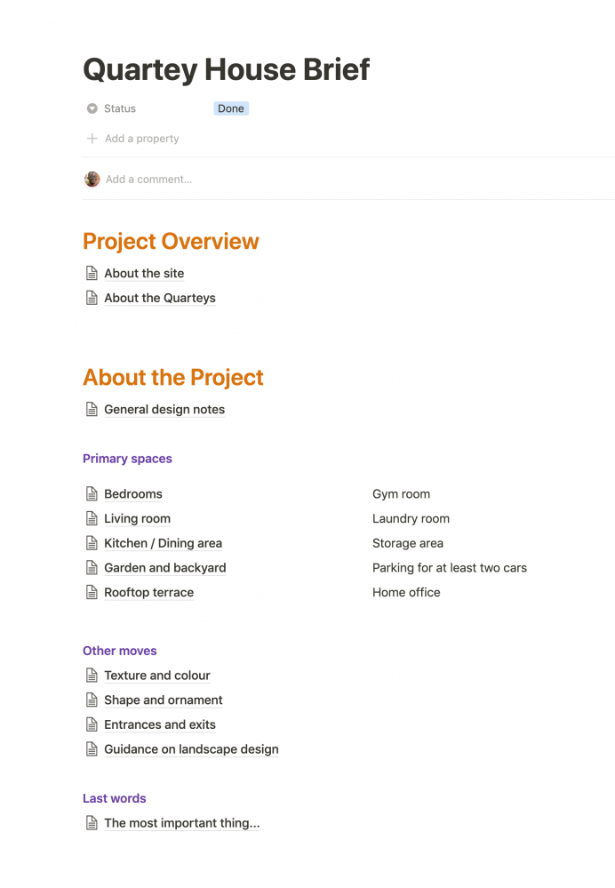
[I use Notion as a shared folder between myself and the Studio Contra team. The Notion space includes content such as the design brief, and documented feedback after each design iteration.]
About the site
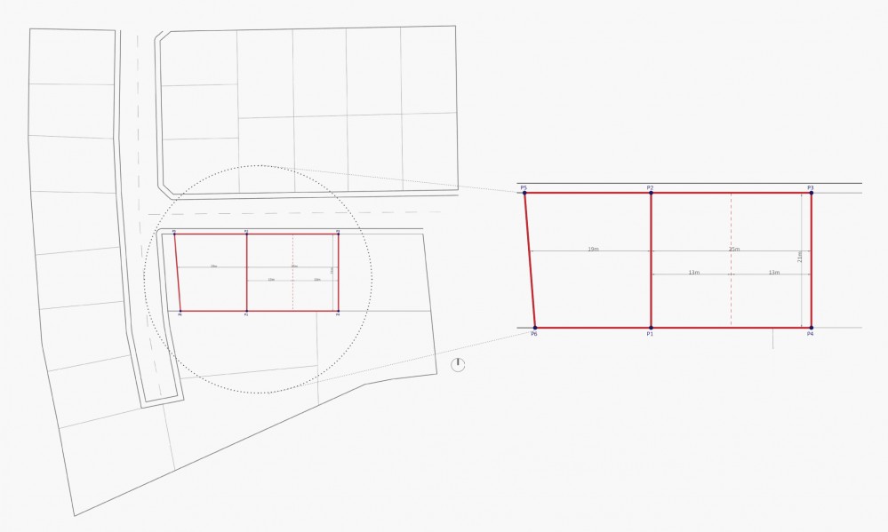
The site is located at Appolonia City, a new development about 45 minutes north of Accra. The site is 140 feet wide and 70 feet deep.
[The actual brief included a PDF of the surveyor’s site plan. I purchased plots bit by bit over several years as funds became available, and stitched them together to create the site.]
About the Quarteys
[It is helpful for the architect to know something about the people who will be living in the home. On this page, I introduced myself as the ultimate decision maker, but explained that the members of my family are important stakeholders, and would have influence over the design direction.
For each member of the family, I share their name, their age, and wrote a short 3 to 5 sentence biography to give the architect a sense of their personality.]
General design notes
[I find that it’s very helpful for designers to have as much context as possible, so this section provided some of that context on a very high level]
While there was a lot of love in our home growing up, it was physically uncomfortable. It was converted from a garage, so the rooms were small, there was no natural light, and ventilation wasn’t great. There was little opportunity for greenery, and a pre-school next door meant that there wasn’t a lot of quiet.
I soon went to boarding school at 14, and then left the country for college, resulting in many years where I didn’t see much of my family. This is the context informing a lot of my thinking about the design of our new home.
We’re looking for a calm, intimate garden of Eden for our family. The goal is for this to very much be an oasis and a respite from the world, and a meeting place for us.
It’s important to mention that in the long term, we aspire to build two properties: a primary family home, and second property to lease out in the short to medium term. As the family grows, that second property might provide further accomodation.
Pinterest board
I’ve been curating a Pinterest board for many months to help me explain to myself what I’m drawn to. You can find the Pinterest board here. [This linked to a private Pinterest board with over 300 examples of design references]
I find myself being drawn to Japanese architecture. There’s something about how they make every space feel both simple and homey, as well as the strong connection to nature.
What does success feel and look like?
Success is a quiet, calming space all of us are excited to return to. Soft and warm and bright.
Lots of (breathing) space: Something we care deeply about is having lots of space. This was something that was at a premium in our home growing up and still feels like a luxury. The way it should manifest should include:
- tall ceilings
- large windows, especially in bedrooms
- lots of natural light and ventilation
A sense of safety and calm: One of the byproducts of our former living situation was a deep anxiety about our physical environment. It is extremely important that while the house is generous with space, that space should still feel sheltered/within our control. The spaces should actively help calm you, especially the private spaces. So for example:
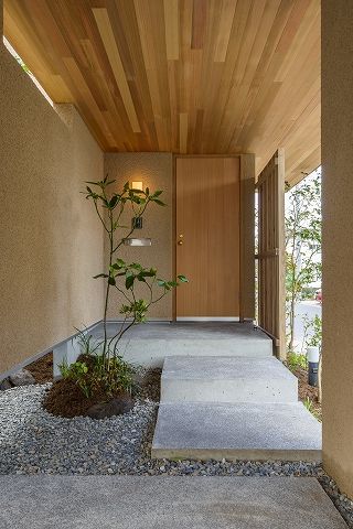
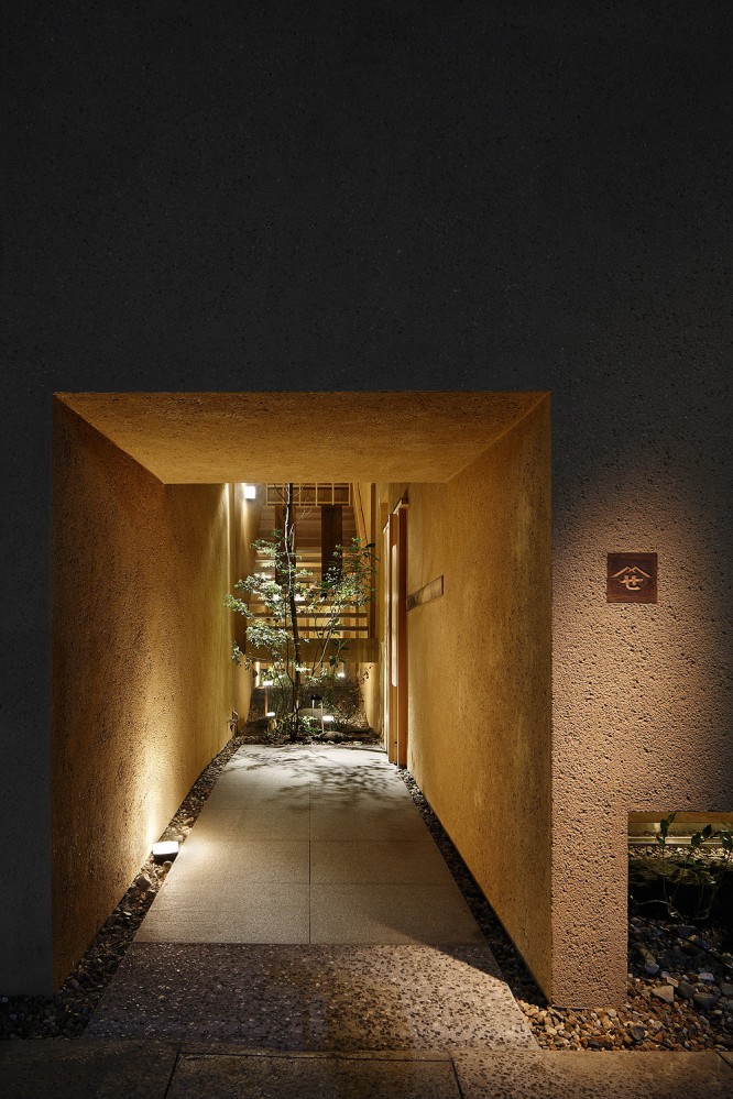
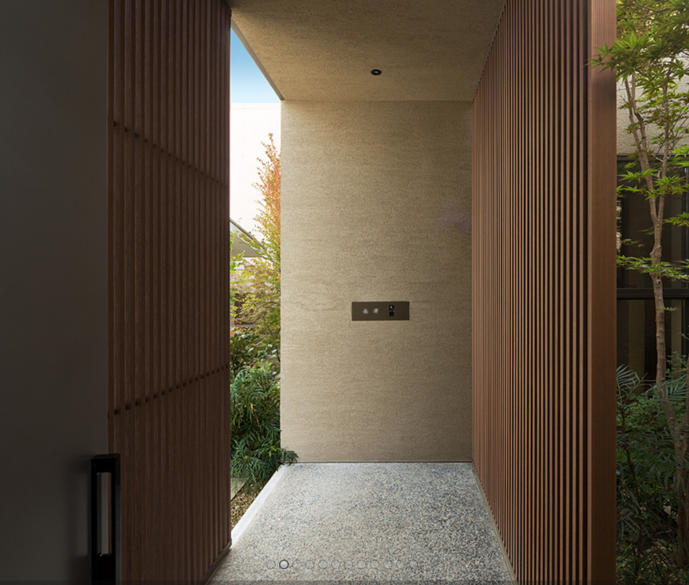
- The entrance should be occluded so that people on the street can’t look straight in
- Soundproofed walls, especially in the bedrooms
- No matter how large spaces are, they should feel intimate. For example, a dining area could also have a small breakfast nook
- In general, lots of alcoves with minibeds and padded areas for lying down
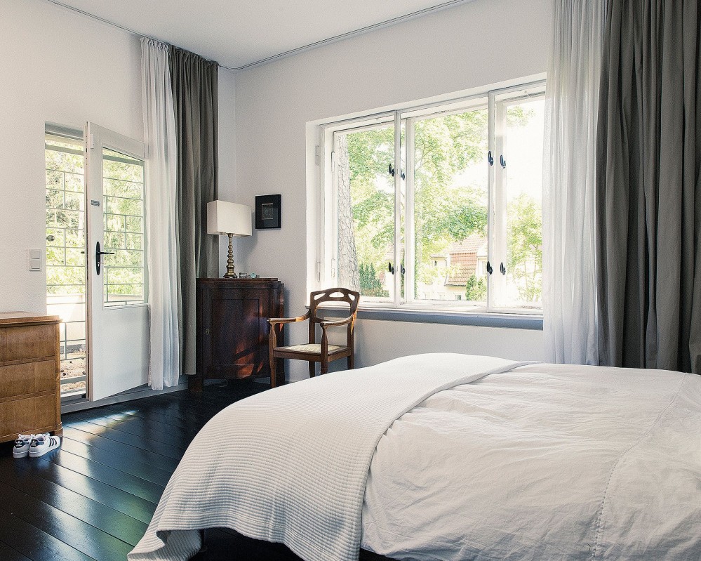
- Bedrooms should probably be gentle whites/creams/greys
Connection to nature: This is something that all of us care about very much, because we lacked it so much. Some of the ways this could manifest include:
- Lots of warm wood finishings and accents
- Internal courtyard, open to the sky
- Lots of plants and trees
- Grey water recycling system
- Garden area for growing plants and raising small animals
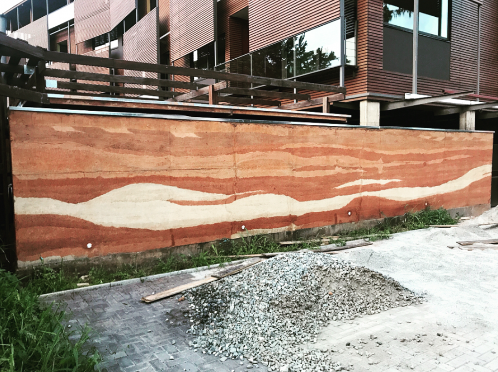
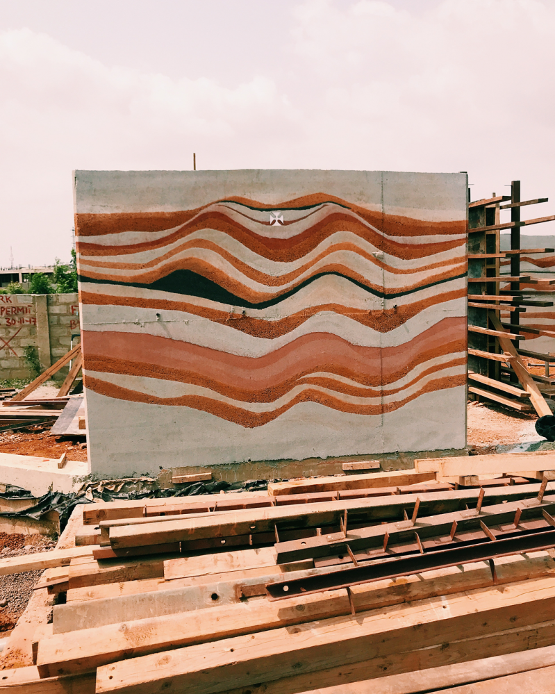
- Exposed brick and rammed earth construction
- Living “green” wall
Celebration of our individual quirks: Ideally the various spaces would reflect various things we’re into. For example:
- the tall ceilings will create large walls which will allow us to print and display large scale copies of Alfred’s photography [My brother Alfred is a professional photographer]
- I have a large collection of fantasy and science fiction books from my childhood, which we can display on public bookshelves
A sense of thoughtful, considered care: It’s hard to put this to words, but in general, the space should exhibit care. For example:
- most spaces should be wheelchair accessible, in anticipation of our mother’s old age
- no door handles with hooks, to prevent clothes snagging on handles
- light switches should be generously wide pads
You’ll find more detailed design notes and references in the Primary spaces section.
Bedrooms
Here are some things to keep in mind for the bedrooms
- We should design for 5 bedrooms. One for each member of the family (4) + 1 guest room
- The bedrooms - like all rooms - should have high ceilings
- All bedrooms should have en-suite bathrooms
- I assume that the ground floor bedroom will be my mother’s to minimize how much stair climbing she’ll have to do
- At least one room (the ground floor room) should have a walk-in closet
All rooms - especially bedrooms - should have large windows to let in lots of light, but also thick curtains that are easily drawn shut to provide privacy.
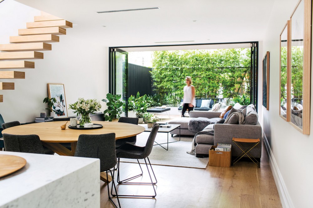
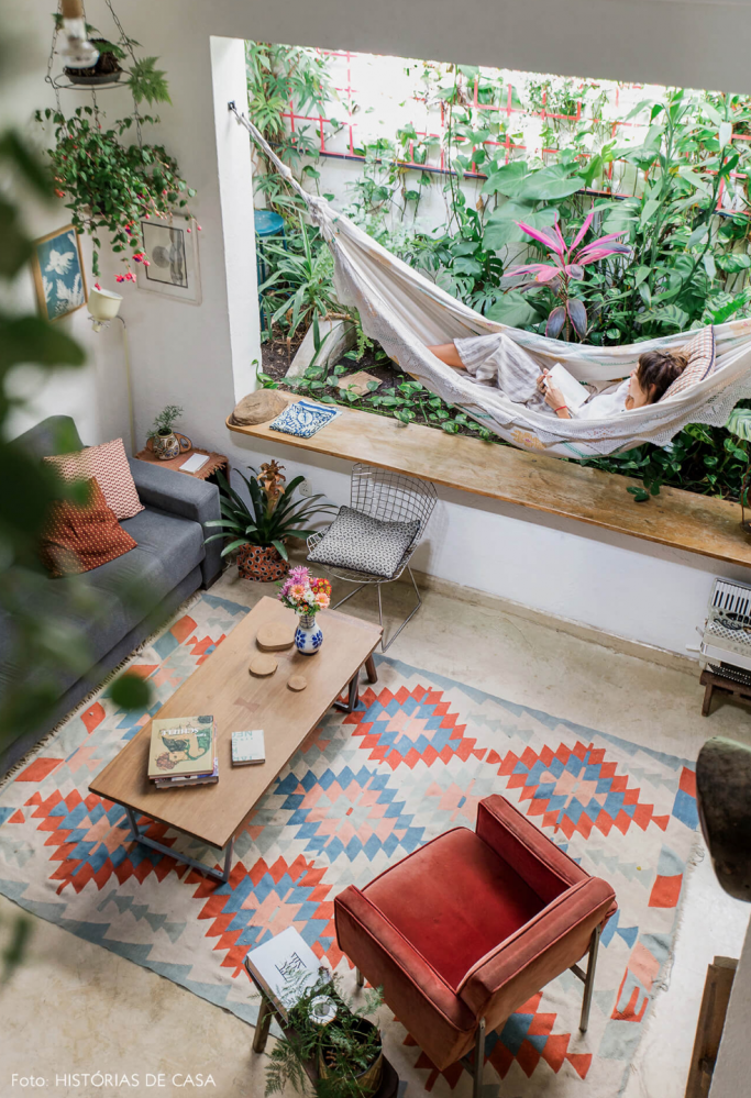
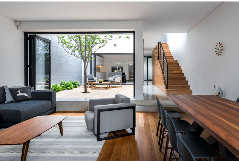
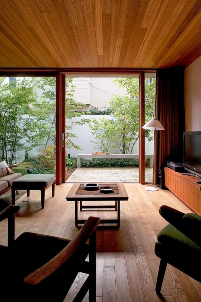
Living room
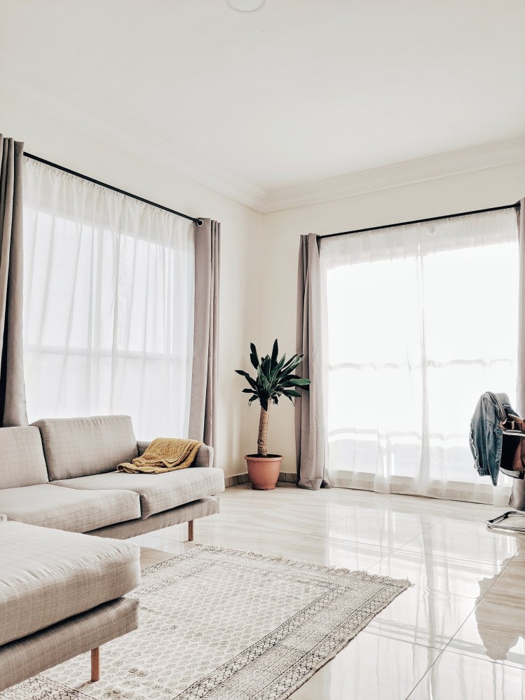
Here are a few things to keep in mind for the living room
- Like all rooms, there should be high ceilings and lots of light
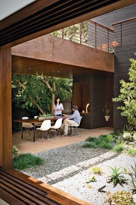
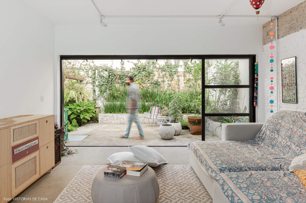
- Living room should play with the idea of inside/outside
- Living room should ideally extend into a private inner courtyard
- Should be a bar/cocktail area for hosting
- Our family owns a LOT of books, mostly my large collection of vintage science fiction and fantasy books from when I was a child. All those books are currently boxed up, but it would be great to be able to display them prominently in the living room
- Alfred’s photographs are incredible. It would be great to display them on the walls at large-than-life scale
- For some reason, there’s something appealing about the idea of a dip in the floor leading to the living room. Something about it makes it feel like a nest / more intimate
Kitchen / Dining area
- Kitchen should have have centre table serving as dining table/chopping board
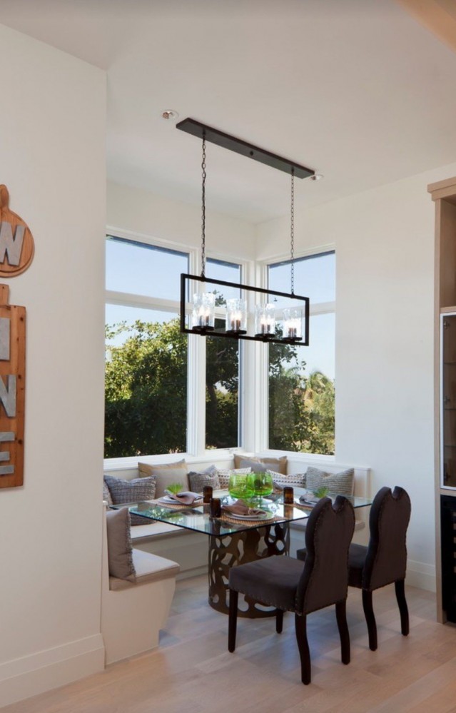
- No matter what else we do with the kitchen and the dining area, there should be an intimate breakfast nook
Garden and backyard
Greenery matters a lot to us.
- A garden area space for David to exercise his green thumb
- Large, shady mango trees
- A private backyard that’s not visible from the street
Rooftop terrace
I’m motivated to take advantage of every possible space, and it seems appropriate to fully utilize the roof as a terrace - assuming the estate will allow us to do so.
Texture and colour
When it comes to texture and building materials, I find myself drawn to seemingly contradictory things.
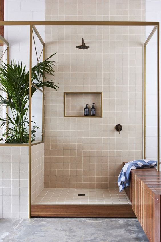
Smooth
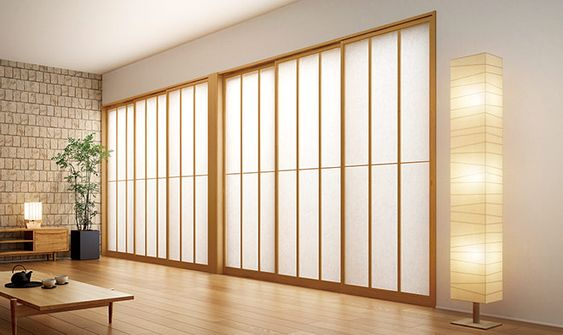
First, I find myself drawn a lot to smooth pastel walls, with warm wooden accents. I suspect a lot of the attraction is because this helps make spaces feel both warm and calming. I see a lot of references I enjoy in Japanese architecture.

Brick
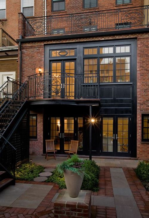
At the same time, I find myself also really enjoying the earthy complexity of brick, especially for exteriors. There’s a certain homey feel I get from a brick building that creates a yearning I can’t explain. Brick houses feel like they contain lot of loving stories that span generations.
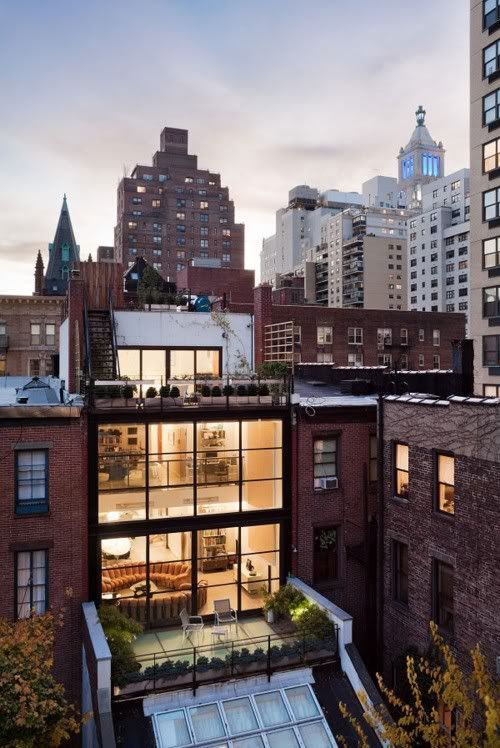
Black steel and glass
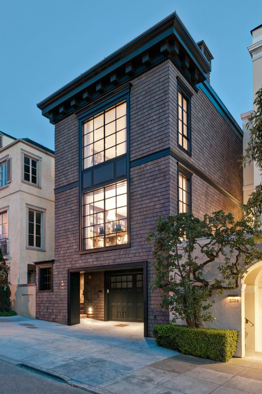
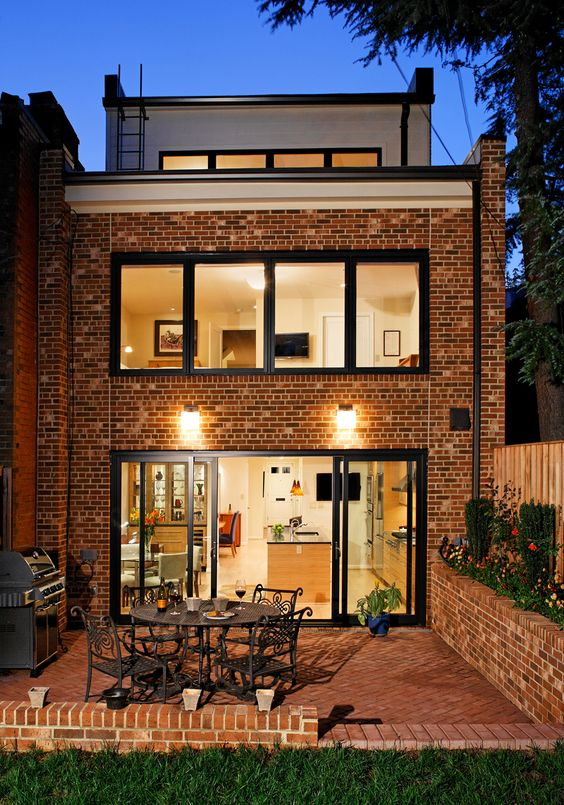
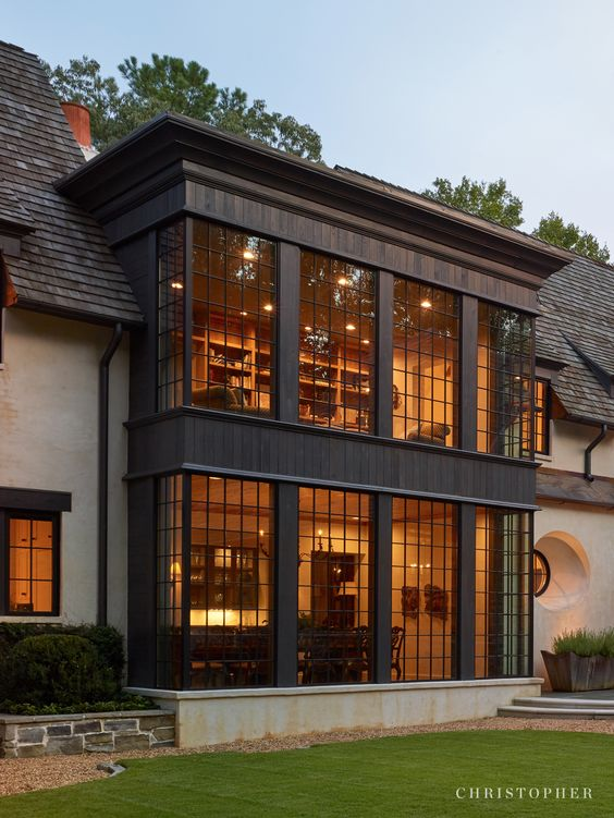
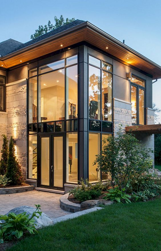
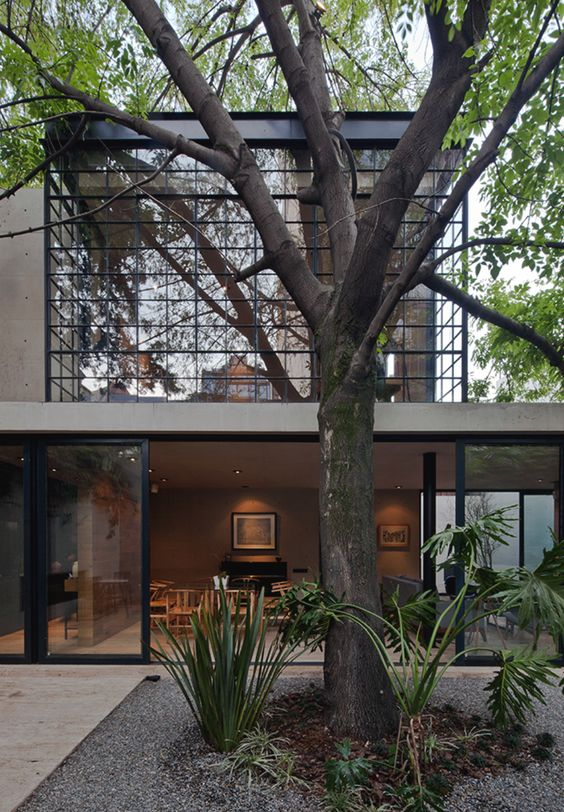
It confuses me how drawn I am to black metal and glass facades. Considering how much I enjoy wooden finishes you’d assume that metal and glass would be the last thing I’d be attracted to.
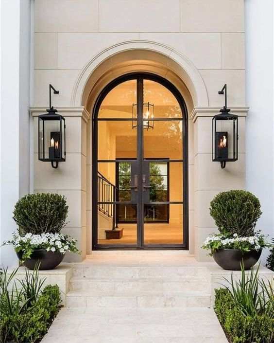
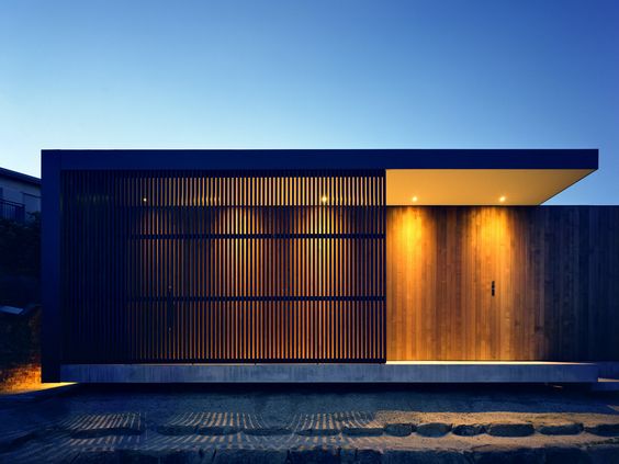
But I really, really like seeing the warm amber glow of a volume of space gently cradled within a simple black metal lattice. These types of space feel like they’re being held lightly. The view speaks of care.
Rammed earth
I recently stumbled across rammed earth construction. I’m not sure I’d like it for the inside walls (the complex patterns might impose a high cognitive load) but there is definitely something appealing about them - some combination of the patterns and their alleged ecofriendly credentials. Maybe they can be useful for garden structures?
All rammed earth photos below from Hive Earth.
Colour
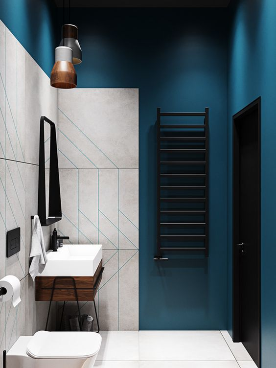
This is an area where, yet again, I find myself drawn to seemingly contradictory things.
As you can see from the rest of this brief, I’m very much drawn to warmth and soft colours, and I think we can assume that’ll be the dominant theme for most of the house.
At the same time, I desire areas of intense colour contrast. My immediate instinct is that the bathrooms might be the best place to explore this, but I’m honestly not resolved in my thinking on this.
Shape and ornament
As has become a recurring theme in this brief, I’m of contradictory minds here. Like you’ve seen elsewhere, my frequent preference is for simple shapes and surfaces. Simple rectangles, clean lines, flat surfaces.
But I also find myself drawn to tasteful expressions of ornament that are interesting enough to delight the eye, but aren’t so complex as to add too much cognitive load.
Arches, for example, sometimes seem like a good compromise between clean simple lines and visual interest.
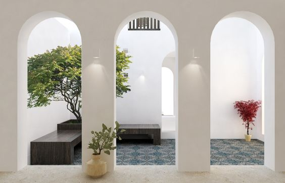
I also sometimes find myself lingering on photos of tessellated planes. There’s something about how light filters through that makes me wistful.
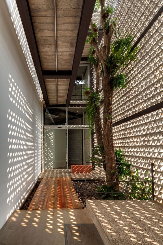
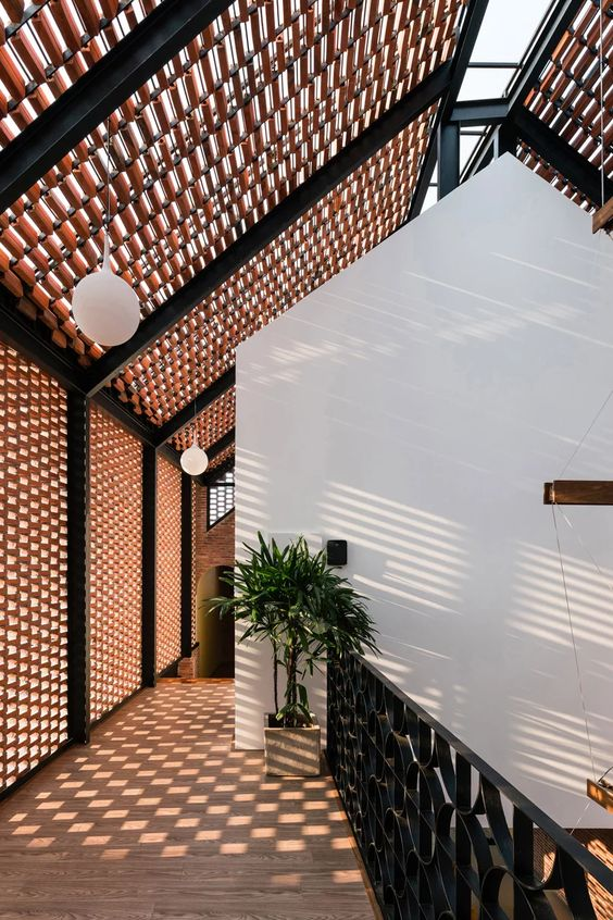
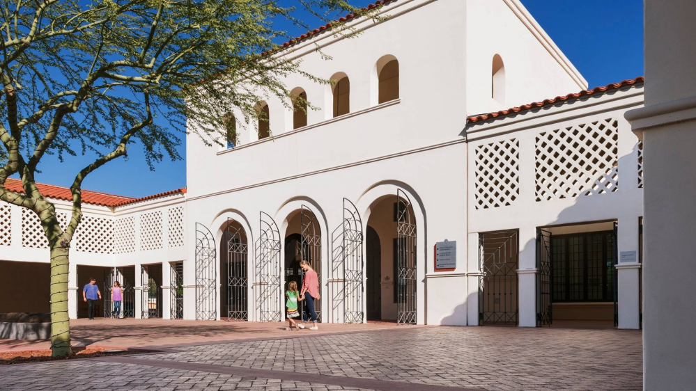
Entrances and exits
Privacy matters a lot to me. Mostly because we didn’t get a lot of it growing up. Partly because I wrestle with anxiety.
The Appolonia City developmental control guidelines require a maximum boundary wall height that I personally consider uncomfortably low, but I still want to feel removed from the eye of the street. I believe that the entrance should be occluded in some way to provide a sense of privacy.
Last words
I care a lot about intimacy. It matters a lot to me that every space in our home creates intimate, special moments between members of our family. I don’t know when next we’re all going to be together. I want to make the time we have left worthwhile.
The most important words that matter to me:
- Intimacy
- Solace
- Softness
- Care
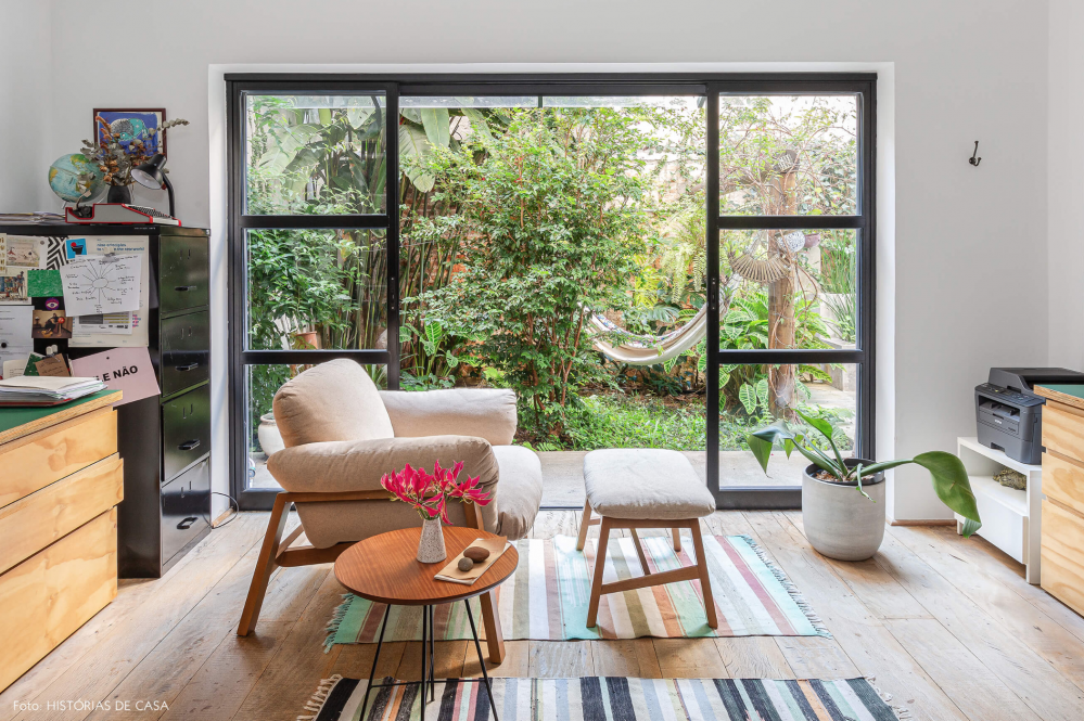
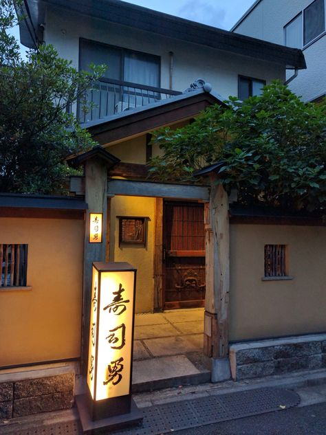
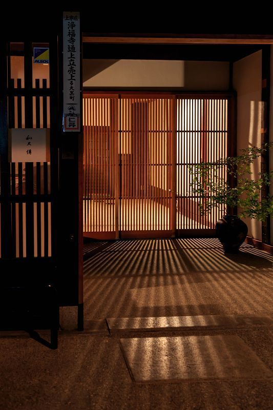
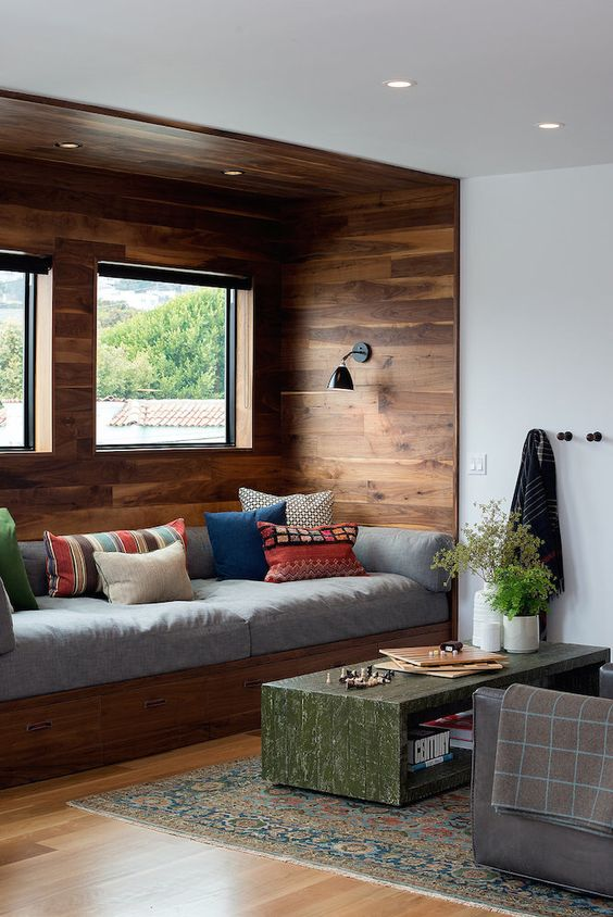
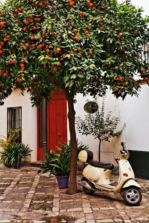
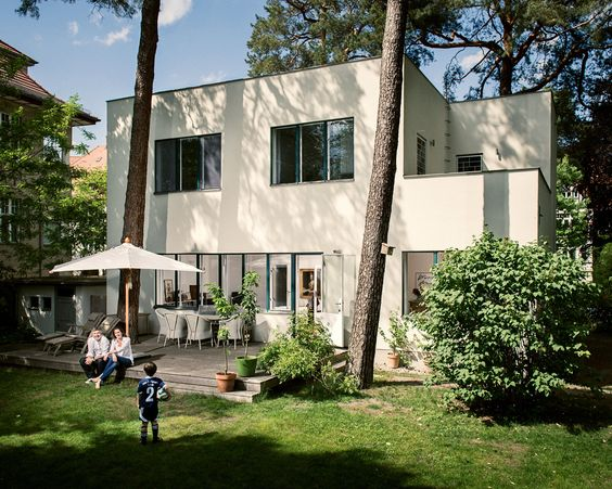
The following are a broad range of images, some of which you might have seen elsewhere in the brief. These images represent these concepts to me, in one way or another.

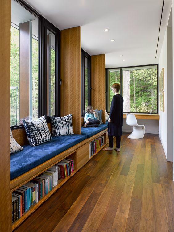
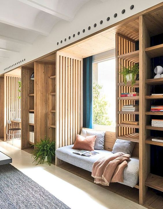
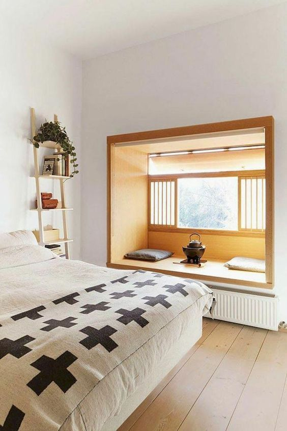
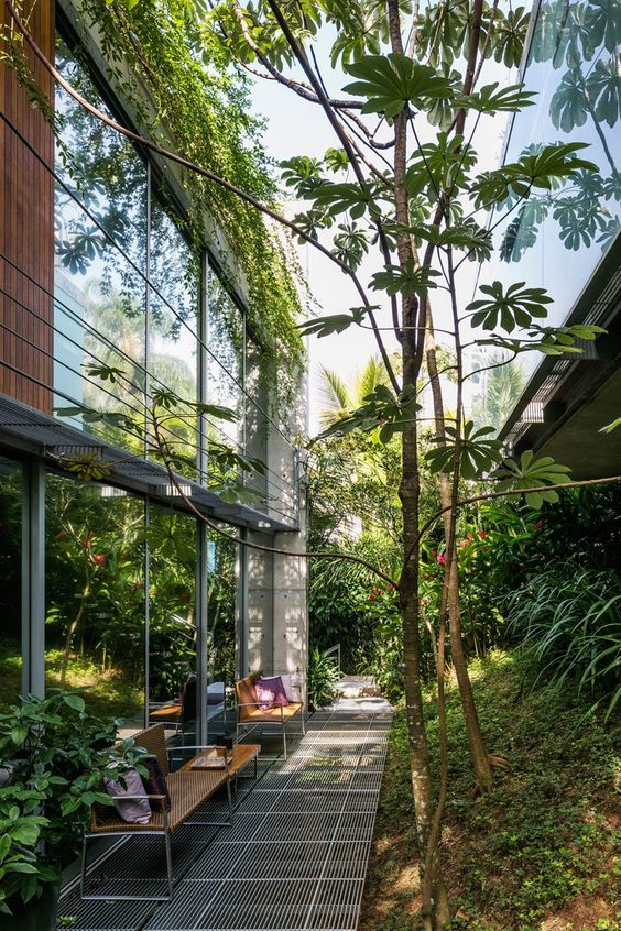
Reading through this again, I’m amazed at how Studio Contra was able to parse this group of sometimes wildly contradictory expressions of desire, and arrive at a program that I fell in love with immediately.
In my next story, I’ll share the early floor plans and massings that they produced in response to this brief. Subscribe to find out when it’s published.
(If you enjoy my writing and want to support my personal research projects, the best way is to buy me a book!)
-
Family Home
-
Family Home
-
Family Home