Favourite architecture studio websites of 2020
Last year, I became more aware of interesting buildings and the teams that designed them. In the process of learning about those teams, I visited the websites of several architecture studios, and discovered a surprising variety of approaches.
It makes sense that people who think often about spatial programs might end up with interesting ideas about how to organise information.
Here are my favourite architecture design studio websites of 2020.
Herzog & de Meuron
Website: herzogdemeuron.com
What I enjoy most about the Herzog & de Meuron website is that it feels like a giant, humming database, with various dials and toggles to tease out the information you want.
On desktop, when you click a link on the website, the content opens as a small embedded window. It’s a little odd to access the content through these small windows, but when you have enough of them on the screen, it feels something like a maker’s bench, surrounded by a kit of parts. It would be nice if you could resize the windows to complete the effect of the Herzog & de Meuron website as a small operating system.
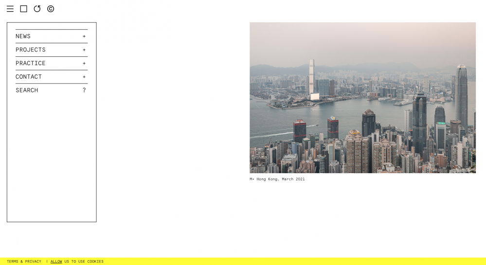
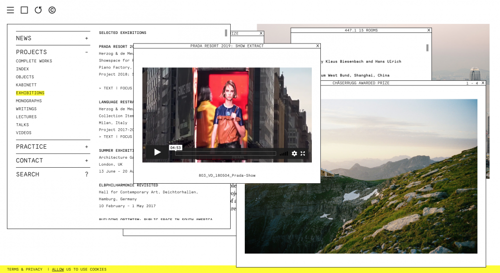
Another thing I like is that the site has very powerful filters. You can filter projects by status (built, under construction, etc etc), typology (healthcare, hotels, museums, etc) or location (by continent or by specific city). I wish all studio sites did this.
This means you can run queries like “show me all built projects in Asia” or “show me all cultural buildings under construction in the Americas”.
And then when you click on a project, you see an almost frightening amount of information, including the number of square meters, building dimensions, gross volume, facade surface area, the names of every member of the H&G team who worked on the project, and all the contractors they worked with to realise the building. This much detail feels so generous.
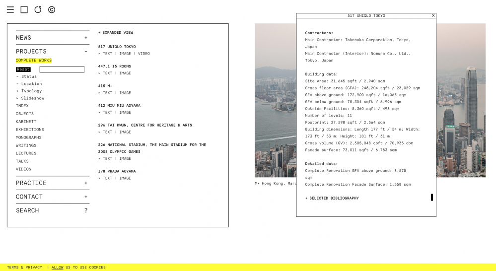
Additionally, there just seems to be a lot of content - videos, blog posts, info about upcoming exhibitions etc etc. It all comes together to make the website feel as if you’re plugged directly into their brain.
David Chipperfield
Website: davidchipperfield.com
In a previous post, I mentioned that David Chipperfield buildings frequently manifest as tall white concrete monuments, always positioned to catch the light. Similarly, the David Chipperfield website landing page is a pure white field, a clear landscape across which examples of their building projects seem placed on a blank map. In the material world, I’m not fond of single buildings looming large in empty fields, but the effect works so well online. (Why does it work so much better online?)
While I maintain that I don’t think I would enjoy living or working in a DCA building, their website might genuinely be my absolute favourite architecture studio website of 2020.
When you go on a project page, you are greeted with large, generous photos of the finished project, and large arrows to help you navigate the carousel.
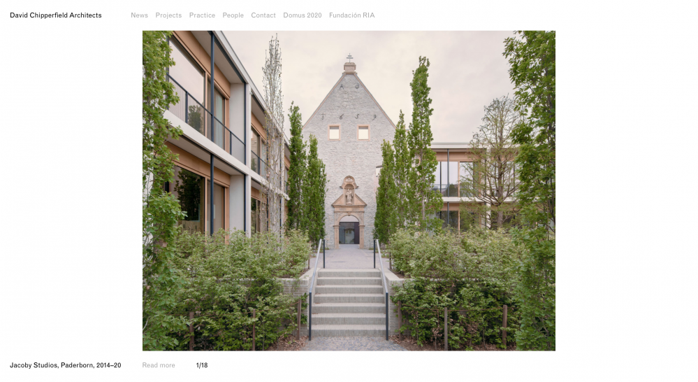
You can click Read more to see a summary of the project, and then further choose to read a full text with more information.
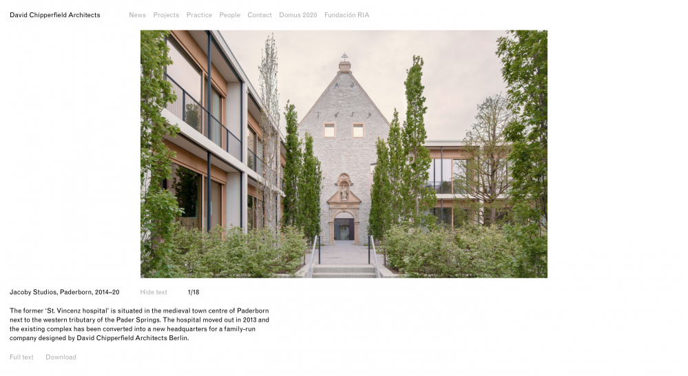
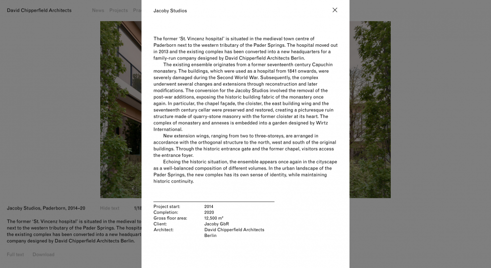
I also really like how you can click a button to download a PDF version of the project. This feels so generous and compelling, and I’m not entirely sure why. Maybe because it signals an awareness that advocates who work at prospective clients might need ammunition to make the case to go with DCA, and there is a certain grace in providing the details in a portable way? I would love to know what made them build this feature.
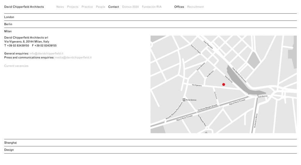
But I think above all, what I enjoy most is how the rest of the site is organised around strict, simple collapsable tables.
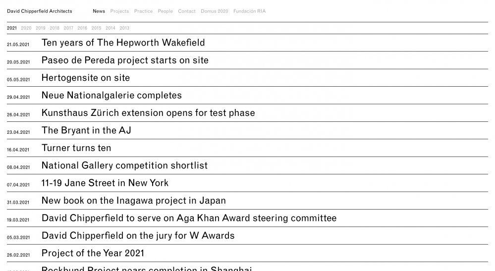
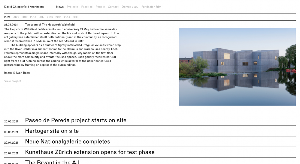
It would be so easy for this to feel cold, but instead, there is something so satisfying about how well-ordered everything is, similar to the satisfaction of a spreadsheet with all the cells properly filled in.
There is something inexplicably kind in seeing that a mind has gone ahead of you, to put everything in its place.
Pfeffer Torode
Website: pfeffertorode.com
This studio also made an appearance in my list of favourite architecture studios in 2020.
Candidly, there is a lot that I wish Pfeffer Torode would borrow from other sites (I wish they would share more information about each project), but I love the evocative way that they organise information on their Residential page: the three categories are: Spaces, Details, Exteriors.
Clicking each one opens a page with a generous grid of high quality images, and despite the complete absence of text, these pages speak volumes about the studio’s aesthetic sense and their point of view.
I especially enjoy the Details page. Where a team’s eye lingers says something about them, and the Details page tells a story of a strong curiosity about materiality and texture.
Feilden Cledd Bradley Studios
Website: fcbstudios.com
The FCB Studios website rivals Herzog & de Meuron in terms of the sheer amount of information it provides about each project. They even frequently list how much it cost to construct each project!
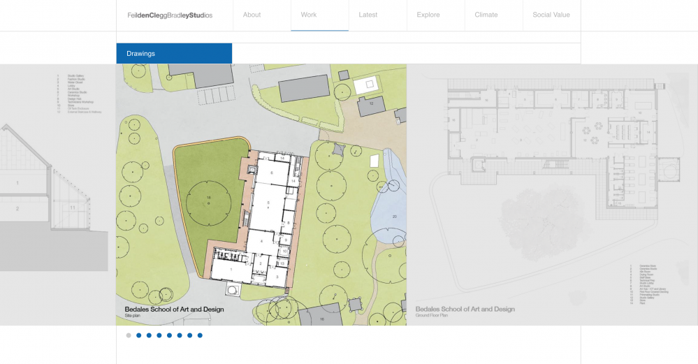
While the design of the site feels a bit dated, I hugely appreciate that several projects include drawings and FLOOR PLANS! 😍
Where other studios approach their project pages like a teaser, FCB Studios approaches them more like case studies, and I appreciate them for it.
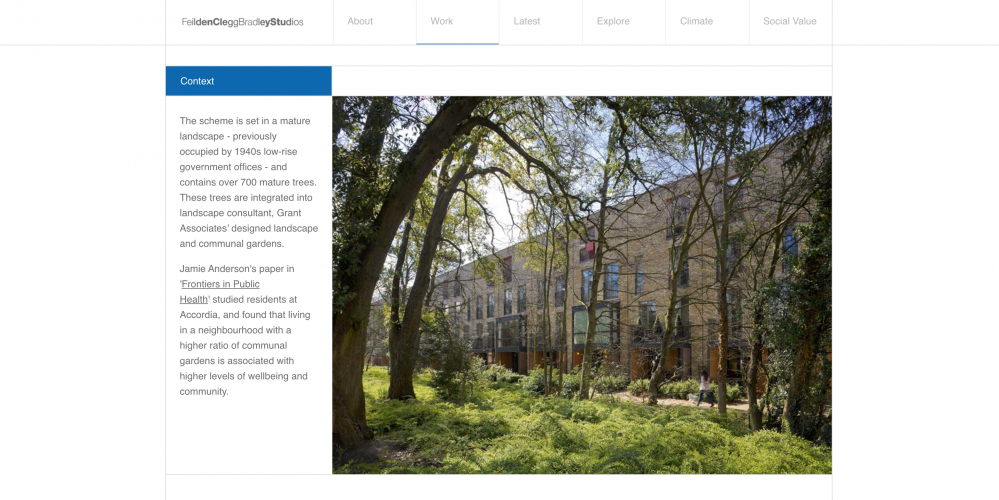
I also really enjoy that they almost always include a special section talking about the context of the building site. This is not something I see often on other studio sites.
Fieldwork
Website: fieldworkprojects.com.au
There are several tiny moves I love about this website.
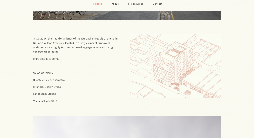
For starters, the coloured line drawings against a cream background have such an evocative, narrative quality.
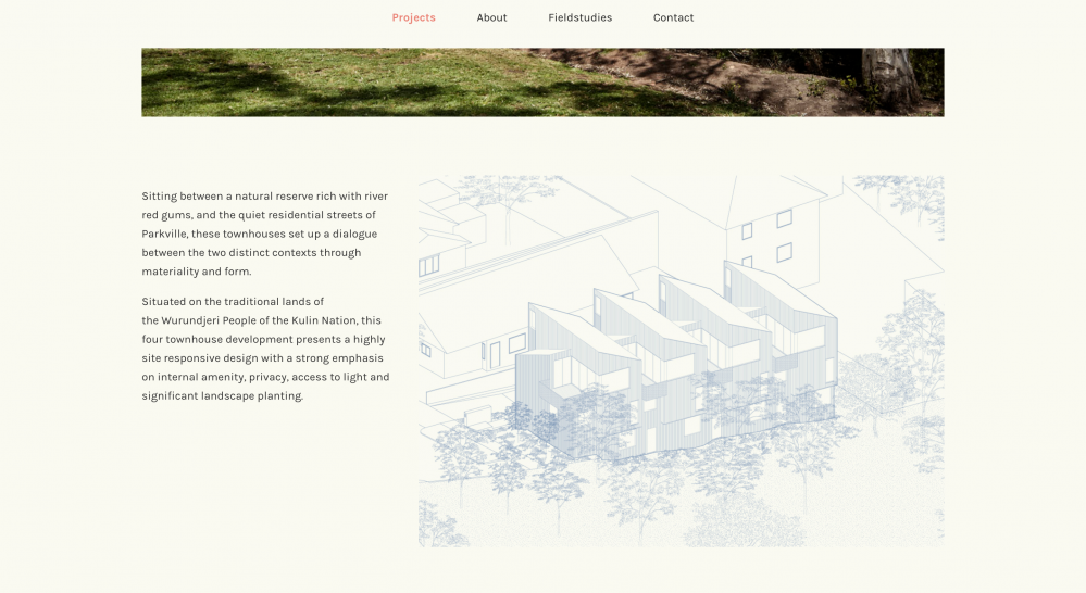
Additionally, the website does two things that situate the projects in a place.
Firstly, project pages begin with an acknowledgement of the original traditional settlers of the site where the building is located. Several websites of Australia-based companies do this, but this is the first time I’d seen it applied to each project individually, versus a single statement covering where the studio’s office is located.
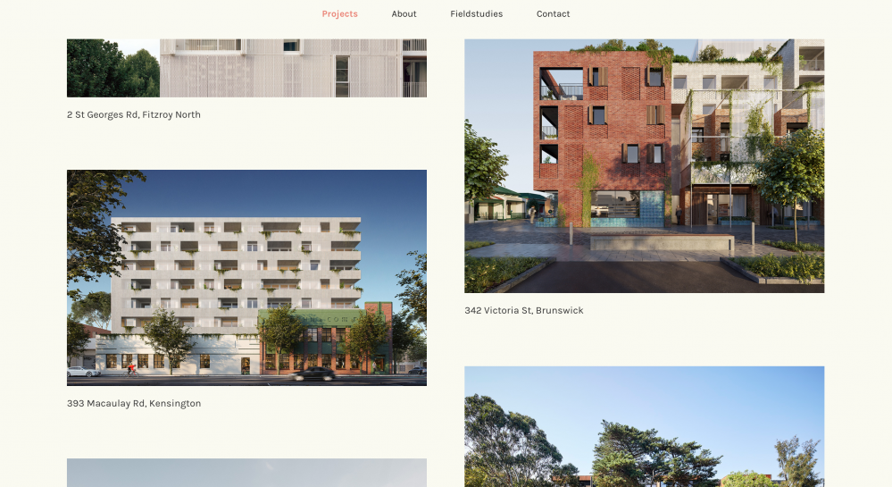
Secondly, I noticed that almost every project is identified only by its address. It’s a small rhetorical move, but this tiny decision feels like it reinforces a desire by the studio to situate their projects firmly within a local, geographical context. To be clear, I’ve seen nothing that proves this was their intention, but considering that the studio runs Fieldstudies, “a dedicated research group within Fieldwork with a mandate to explore social issues facing urban Australia through architecture,” it’s fair to assume that issues of site and context matter a lot to them. Plus, it’s heavily implied in their name, which I love.
(If you enjoy my writing and want to support my personal research projects, the best way is to buy me a book!)